Explore controls
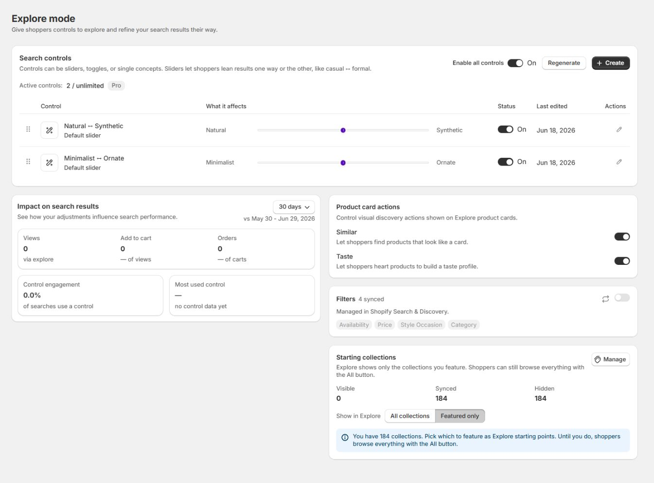
Explore controls adjust result ranking by concept. They can be sliders, toggles, or single concepts, such as a Casual to Formal slider. Manage them under Explore mode.
What you can do here
Section titled “What you can do here”- Turn Explore controls on or off, and generate a default set from your catalog.
- Create, edit, reorder, activate, deactivate, and delete individual controls.
- Turn on Similar and Taste actions on Explore product cards.
- Choose which filters and starting collections shoppers see.
- Review how shoppers are using your controls.
The three control types
Section titled “The three control types”A control adjusts results toward a concept. Choose one of three types:
- Slider (vs) runs between two opposing concepts, for example minimal to bold. The shopper drags a thumb, and the middle is neutral. Use it when a concept has two clear ends.
- Toggle offers two side-by-side options the shopper picks between, or clears, for example natural or synthetic. Use it for either-or choices.
- Single applies one concept on a slider with a neutral middle, for example waterproof. Use it when the concept has no natural opposite.
Results re-rank when a shopper changes a control. Positions are stored in that browser until the shopper resets them or the available controls change.
Turn controls on or off
Section titled “Turn controls on or off”The Enable all controls switch at the top of the Search controls card is the master switch. When it is off, shoppers see no controls on the storefront and the rest of the Explore settings are hidden in the admin. Turn it on to set everything up.
Generate your default controls
Section titled “Generate your default controls”VIBE can generate controls from the product data in its copy of your catalog. Update VIBE’s copy of your catalog before generating them.
Select Regenerate to replace default controls. Custom controls are preserved. If no new controls are generated, the current set remains unchanged.
Create a custom control
Section titled “Create a custom control”Select Create in the top right of the Search controls card. The Add custom control dialog opens.
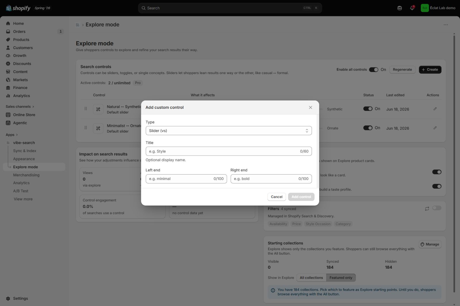
- Choose a Type: Slider (vs), Toggle, or Single.
- Enter the concept labels. A slider asks for a Left end and a Right end (for example minimal and bold). A toggle asks for two options. A single asks for one concept. Each label can be up to 100 characters.
- Optionally enter a Title (up to 60 characters) as the display name. Leave it blank to name the control after its concepts.
- Select Add control.
A new control becomes active if the plan limit has not been reached. Otherwise, it is added in an inactive state.
How to check it worked: the control appears in your controls list, and on your storefront’s Explore mode if it’s active.
Edit, reorder, activate, and delete
Section titled “Edit, reorder, activate, and delete”- Edit: select the pencil on a control’s row to change its title or concept labels. The type cannot be changed once a control exists, so to switch type, create a new control. Editing a custom control’s labels also changes how it leans results.
- Reorder: drag a row by its handle. Controls appear to shoppers in the order you set, grouped by type.
- Activate or deactivate: use the status switch on each row. Only active controls appear to shoppers.
- Delete: custom controls have a delete action. Default controls cannot be deleted; use Regenerate for a different default set.
The Active controls count and plan badge show current use against the plan limit.
Plan limits
Section titled “Plan limits”The number of controls you can have active at once depends on your plan. The limit counts active controls only, so you can keep more in your list and leave the extras off.
| Plan | Active controls | Storefront Explore |
|---|---|---|
| Starter | Not available | Not included |
| Growth | 4 | Search experience |
| Pro | Unlimited | Search and standalone block |
| Enterprise | Unlimited | Search and standalone block |
When you reach the cap, the page shows your active count (for example 2 of 2) and asks you to turn one off or upgrade before activating another.
Product card actions
Section titled “Product card actions”The Product card actions panel controls two discovery actions shown on Explore product cards:
- Similar lets shoppers find products that look like a card.
- Taste lets shoppers save products and build Your Vibe recommendations.
Turn each on or off with its switch.
Filters and starting collections
Section titled “Filters and starting collections”- Filters shows the Shopify Search and Discovery filters in use (for example Availability, Price, Shape). These are managed in Shopify, so they appear here as read-only. Use Refresh filters from Shopify to pull the latest.
- Starting collections sets which collections in VIBE’s copy of your catalog appear as Explore starting points. The default Featured only mode starts with no featured collections. Select Manage to choose them, or switch to All collections. Hiding a collection here does not remove it from normal search.
Metrics
Section titled “Metrics”The Impact on search results card shows how shoppers use your controls over the period you select, against the period before it:
- Control engagement is the share of searches where a shopper used a control.
- Most used control is the control shoppers adjust most, with how many searches used it.
Views, Add to cart, and Orders are the funnel for shopper visits where a shopper used a control: products viewed, the share that added to cart, and the share of carts that ordered.
The small rail in the controls list, under “What it affects”, is read-only. It shows the average direction shoppers have leaned that control, not a position you set.
Recommendations
Section titled “Recommendations”- Generate defaults first, after updating VIBE’s copy of your catalog, then add custom controls for concepts specific to your catalog.
- Keep labels short and clearly opposed, like minimal and bold, so the lean is meaningful.
- Watch Control engagement to see which controls shoppers actually use, and replace the ones that get little use.
Recipe: a casual to formal slider
Section titled “Recipe: a casual to formal slider”- Open Explore mode and select Create.
- Choose Type: Slider (vs).
- Set Left end to “casual” and Right end to “formal”. Optionally name it “Style”.
- Select Add control.
The new slider starts in a neutral position. Review Control engagement before adding more controls.
Troubleshooting
Section titled “Troubleshooting”A control I created is not showing to shoppers. Confirm that Enable all controls is on, that the control’s own status is on, and that you are within your plan’s active-control limit. Controls beyond the limit stay off until you free a slot or upgrade.
Can I set where a slider starts for shoppers? No. A slider starts neutral in the middle, and each shopper’s position is remembered in their own browser until they reset. The small rail in the admin list is read-only and shows the average direction shoppers have leaned the control, not a starting position you set.
My defaults look generic. How do I make them fit my catalog? Update VIBE’s copy of your catalog first, then select Regenerate so VIBE builds the set from your own products. Add custom controls for concepts specific to your store. Regenerating keeps your custom controls.
If something looks wrong: see An Explore control has little effect in the diagnose guide.
For the complete shopper workflow, filters, collection curation, and standalone block setup, see Explore and Smart Filters.